Cape Kaido Ōmishima, JdV by Hyatt
The Sankei Building Co. Ltd. · Tokyo, Japan · 2026
Client brief
Own the “third engine”
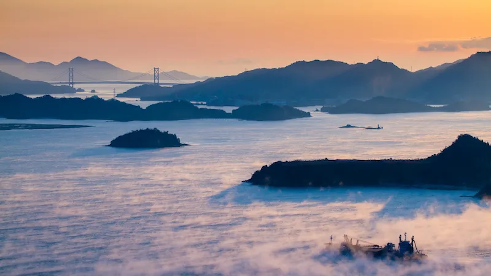
Shimanami Kaido moves people beautifully. Cyclists and scenery-seekers flow through the corridor by the thousands, carried by a route built for motion — well-designed for a one-day through-ride or a flexible partial journey, supported by strong infrastructure and gateway cities in Onomichi and Imabari. The result: a huge amount of demand passes through the islands without ever stopping the night.
The market’s two established engines — cycling and scenery — are strong, but they’re also shared by a field of small, seasonal operators who reinforce Shimanami as a route to complete rather than a destination to stay in. What the market lacks is a third engine: a credible, year-round reason to stop.
Normal . was engaged to design that third engine for a 129-key hotel positioned to become the corridor’s primary overnight base — not by out-competing the cycling crowd, but by converting corridor flow into one more night. The opportunity centered on Ōmishima itself: the island with the highest visitor arrivals in the Shimanami chain, an already-established culture of stopping and spending, and a deep cultural anchor in Oyamazumi Shrine and the legacy of the Murakami Kaizoku.
Who is Normal .
Normal . is a preferred branding agency of Hyatt Hotels Corp. Japan / Micronesia and was tasked to develop the Brand and Visual Identity for the very first JdV by Hyatt proposed in Ōmishima, Ehime prefecture.
For a brand as specific as JdV by Hyatt — spirited, independent-minded, built on local connection — that meant carrying its tone all the way through, not translating it into generic hospitality language along the way. Normal . brought its full methodology to Cape Kaido: from naming and market positioning to brand voice, verbal identity, and visual identity — extending JdV’s joy of life into a rhythm the hotel could own on this specific stretch of coastline.

Drift. Dwell. Shift.
The Big Idea, Normal . Method
Two personalities arrive at Cape Kaido with the same quiet ask: give me back my rhythm.
Except they aren’t two travelers — they’re one. The same guest who seeks internal balance on one occasion, as a Pace Restorer relieving a life that rarely leaves room to slow down, seeks external connection on another, as a Cultural Drifter drawn to place, story, and people. It’s the same mindset, worn two ways. Cape Kaido doesn’t choose between them. It’s built to hold both — meeting a guest in whichever mode they arrive in, and letting them move freely between the two across a single stay, in three movements.
Drift. On a route built for scenery and motion, the journey is often experienced in passing. But overstimulated, over-scheduled travelers are looking for a different kind of escape — not achievement, but a change of rhythm. Cape Kaido lets guests loosen the grip of speed and distance and drift out of the rush.
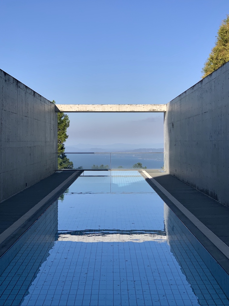
Dwell. Cape Kaido is a hotel built for dwelling — where the journey becomes a stay. An unhurried welcome, a calm flow through wide horizons, all-day dining with an easy gravitational pull, lounges that invite connection, and terraces that reward staying a little longer. Guests dwell to open time.
Shift. Guests leave with a clearer mind and their rhythm returned — carrying something forward long after checkout, in how they pace a day, notice more, and lean into joy of life. Not a stay to repeat, but a rhythm to shift into again.
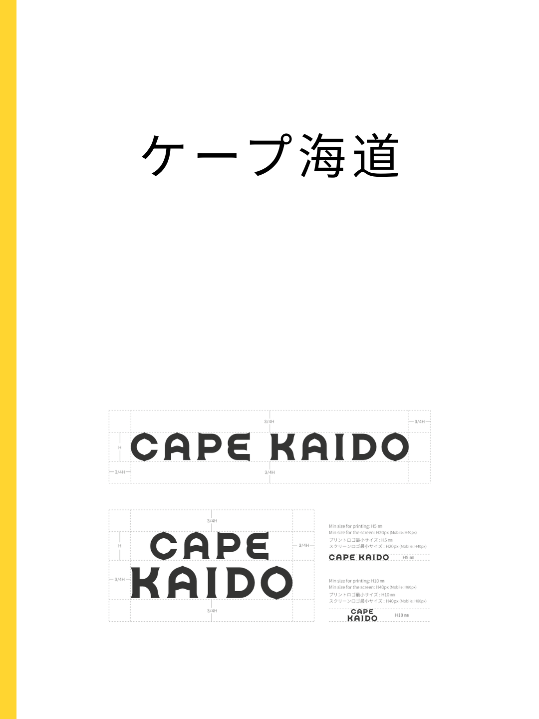
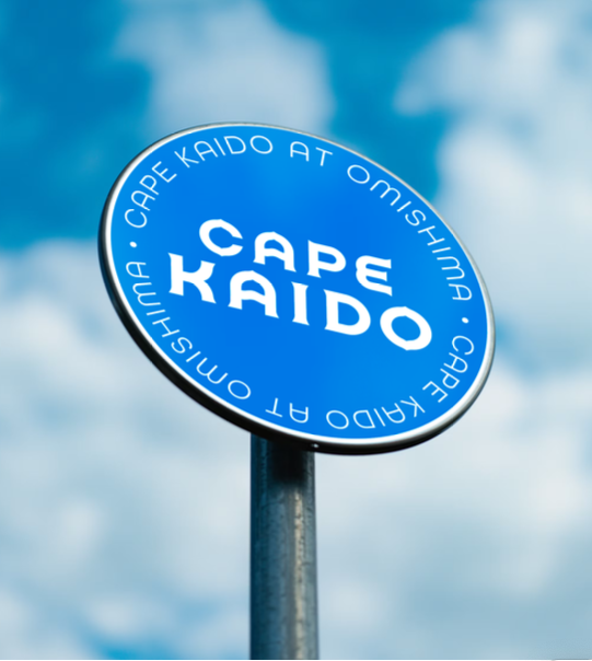
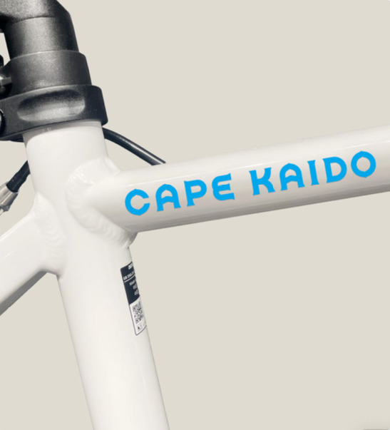
Cape Kaido ケ〡プ海道
A cape is a piece of land that extends out into a sea, ocean, or lake. It is a coastal feature, often a prominent landmark for navigation.
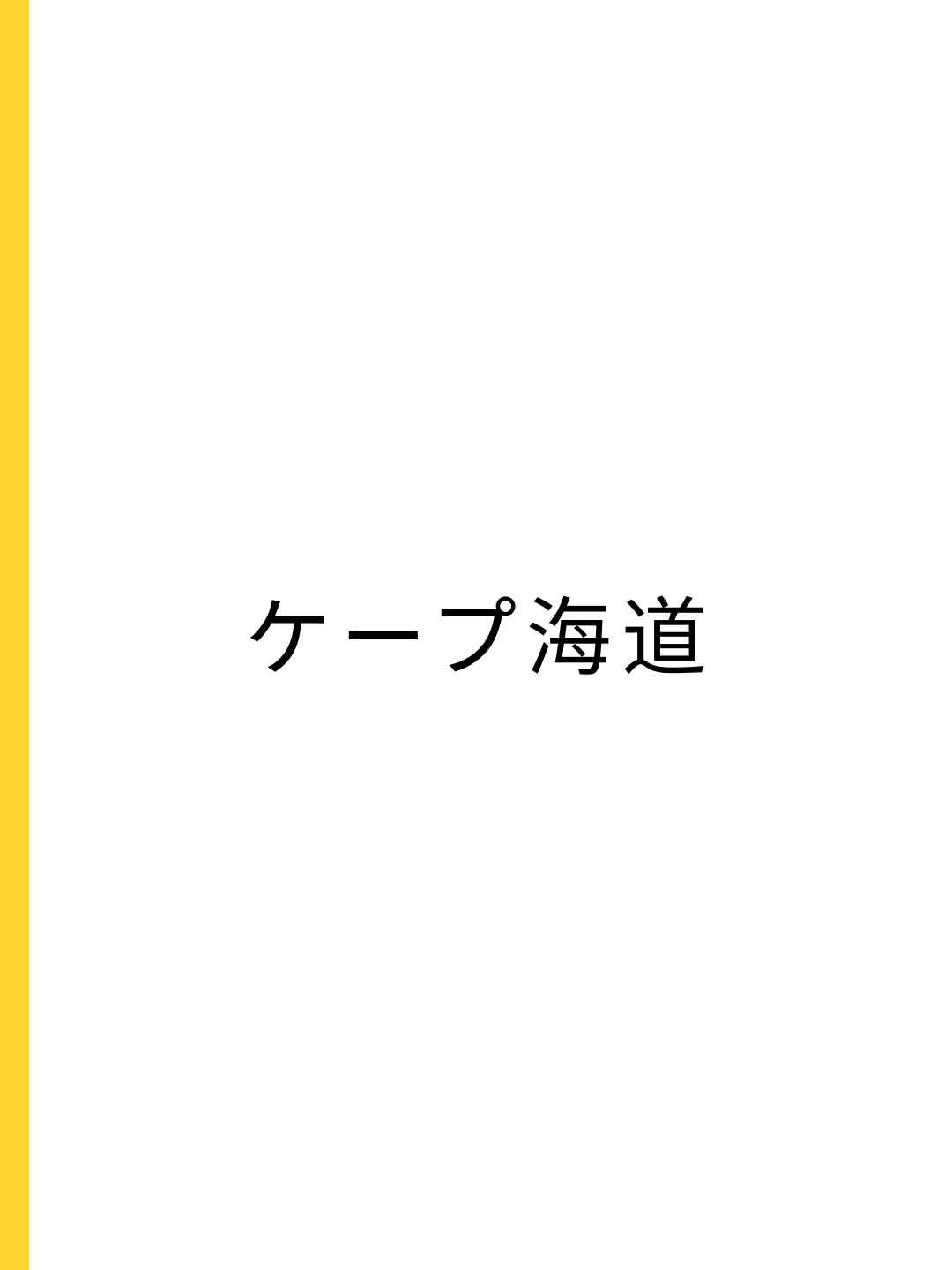
Directly rooted in しまなみ海道; literally “sea route / maritime way.”
Cape Kaido is deliberately place-coded. Cape and Kaido, together, read clearly to both international and local guests as exactly what the hotel is: a place to stay, rooted in a road built for passage.
Visual Identity
Place Coded
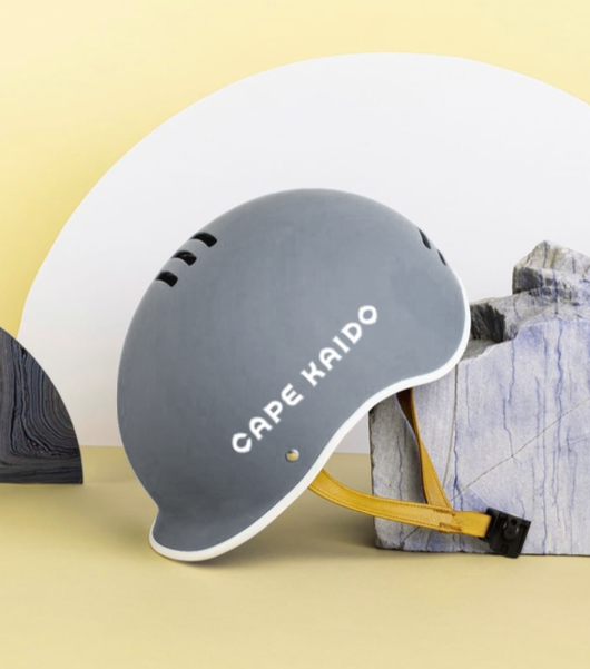
Cape Kaido translates Drift. Dwell. Shift. into a visual language of movement and forward energy. Inspired by the Murakami Kaizoku and Ōmishima mark, Cape Kaido name and logo is place-coded and has genuinely ownable visual character.
A logo that begins in motion — carrying the memory of sea routes, flags, and passage.
Kaido has always meant place. The mark is a stamp of arrival — Dwell, made visible.
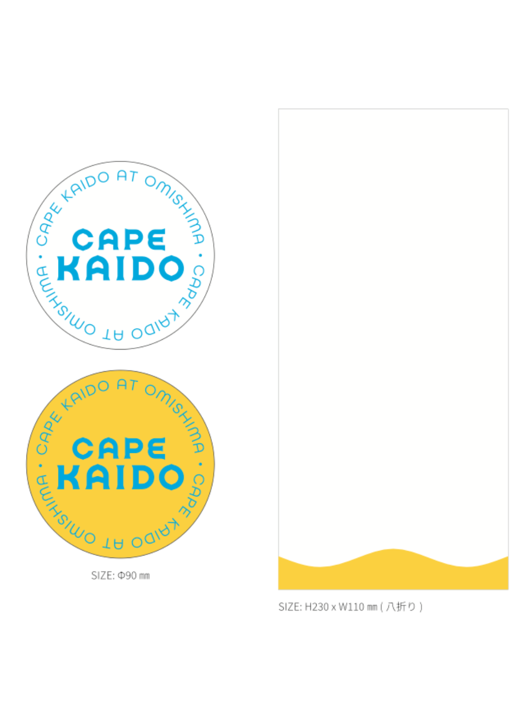
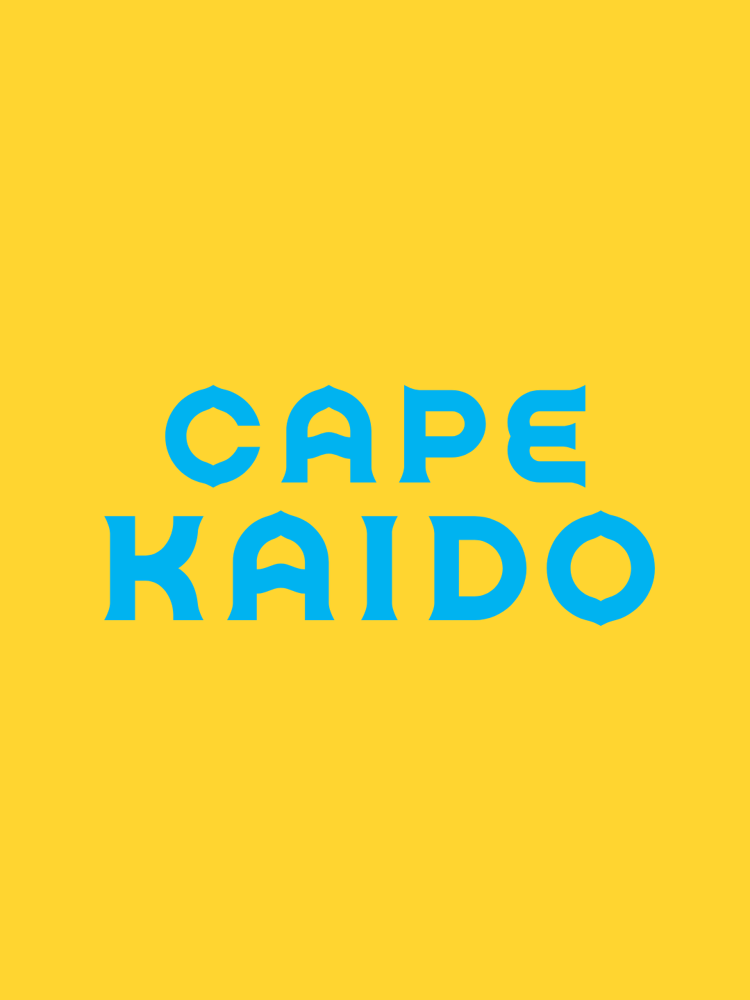
“Setouchi lemon” brings brightness and local warmth — the color of everyday joy on Ōmishima.
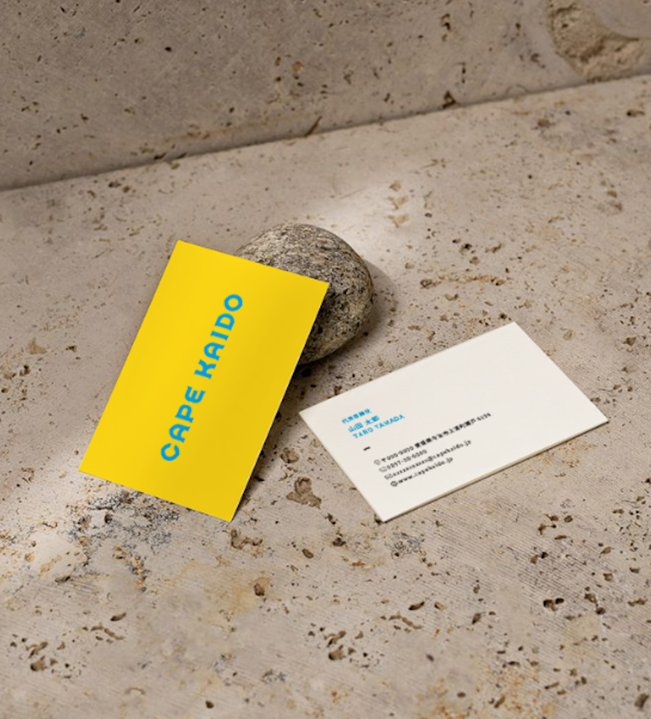
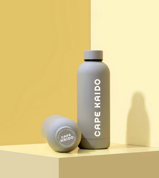
“Shimanami blue” traces the Shimanami Kaido’s own blue lane — a shared route, now a shared identity.
Clarity balanced with warmth: distinct, sunny, and human.
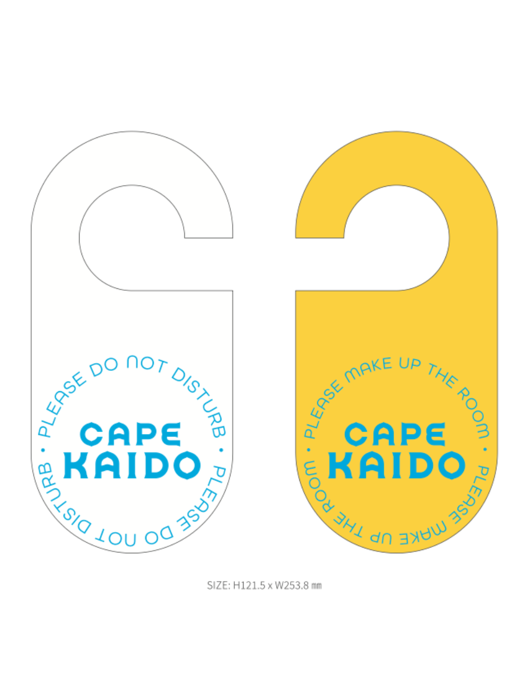
Setouchi lemon and Shimanami blue together carry forward the emotional energy of Shift.
The cycling route was never really about bicycles. It’s the newest layer of a passage that’s existed since the Murakami sailed these waters — and once you feel that, you stop wanting to pass through quickly.
このサイクリングロードは、本当は自転車のためだけのものではありません。村上海賊がこの海を渡っていた時代から続く、通り道の最新の層にすぎないのです——そのことを一度感じてしまうと、急いで通り過ぎたいとは思わなくなります。
Jinou Park, Founder of Normal .
Talk to Normal .
We help brands uncover what makes them different — and express it with clarity, craft, and conviction.
Our clients choose Normal because we combine strategic depth with creative artistry. You work directly with the founder and senior experts — every time. No layers. No dilution.
Whether you’re defining a new brand, repositioning an existing one, or shaping a place that tells a story, we help translate purpose into experience — turning insight into impact.


