How a Barolo house, Vietti, dresses its bottles: one artist’s hand on almost every label, a guest artist on the rarest bottle, and a walk through the vineyards that explains both.
Somebody put a cricket on a bottle of Barbera in the 1970s, and Vietti never took it off.
Vietti’s cantina, Italian for winery, sits at the top of Castiglione Falletto, where the cellar burrows into the hill beneath the old castle. Its shop doubles as the guest reception. The room is bright and crisply lit. The interior is pale beechwood, simple and calm, so everything with colour in the room belongs to the house: the bottles, their labels, and a run of posters and merchandise that looks closer to a modern art museum than a Barolo estate.
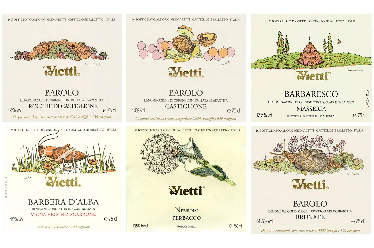
Look along the shelves and the cricket has company: a snail, a sheaf of wheat, rosehips. Of the 26 labels the estate uses, all but two were drawn by one man, Gianni Gallo. I carry that thought out the door and down the hill, behind William, my guide on the vineyard trail, whose backpack clinks with every step in a way I put down to equipment.


Scarrone
The trail leaves the village and drops straight into Scarrone, a southeast-facing slope under the castle turret, close enough that the castle seems to lean over the vines. At the first stop, William’s equipment turned out to be Barbera: two bottles of Barbera d’Alba, Trevìe and Vigna Scarrone.
Barolo is mapped down to the hillside. Since 2010 its slopes have been divided into officially named vineyards, the menzioni geografiche aggiuntive, or MGAs, Barolo’s version of the cru.
Most estates save that precision for their Barolo. Vietti applies it to Barbera too, the everyday wine of the Langhe and the one meant for a pizza dinner. Trevìe brings together grapes from several sites. Vigna Scarrone comes from this one slope. Side by side, Vigna Scarrone had more tannin, some of it from barrique, and more acidity to carry it. The extra structure and the extra lift held each other in a bold balance that Trevìe didn’t attempt.

The way I heard it at the winery, when Luca Currado joined the family business, his father Alfredo kept him away from Nebbiolo until he could show he made Barbera properly. Barbera first, Barolo after. On a slope like this, that sounds less like a punishment than a curriculum.
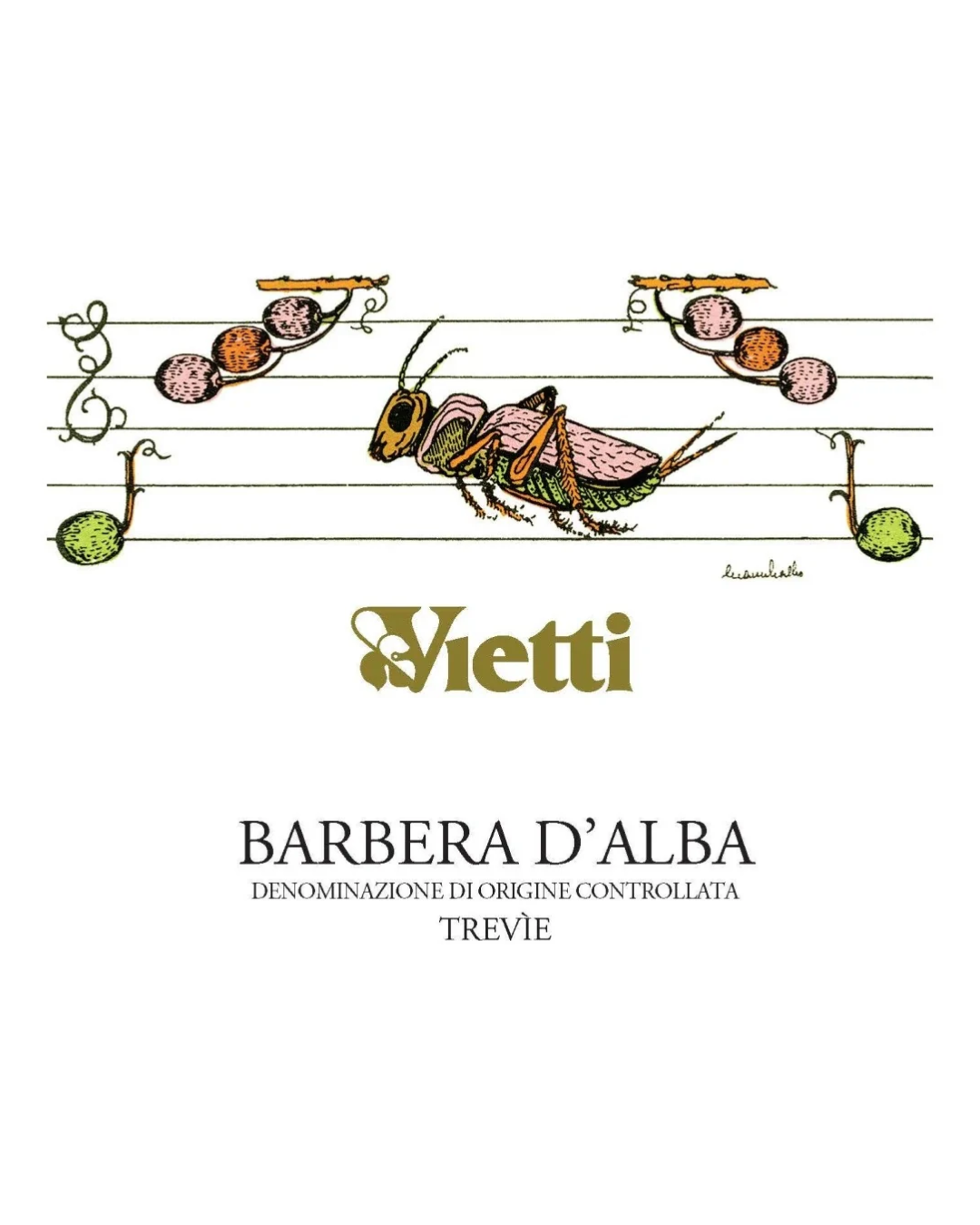
Barbera also carried Gallo’s most famous early label. In the early 1970s he gave Vietti’s Barbera a cricket sitting on a musical stave. In a second version the same insect hides among grass and flowers. Put next to the crests on a wine shelf of the time, it must have looked almost reckless. A visiting German journalist said as much. Gallo and the family kept the cricket. In 1984 the British magazine Wine & Spirit gave design awards to six of his labels, all of them Vietti’s.
Gallo and the family kept the cricket. In 1984 the British magazine Wine & Spirit gave design awards to six of his labels, all of them Vietti’s.
Between the vines
Gallo was born in 1935 at his family’s farm in Dogliani. He studied engineering in Torino, left it unfinished, and in 1964 went home to the vineyard and the cellar. He learned printmaking from the painters Claudio Bonichi and Eso Peluzzi, then spent the rest of his life looking very closely at the Langhe.
The method is what keeps the labels modern. He worked in woodcut and technical pen, in flat fields of colour, and cut the colour separations by hand on tracing paper. He chose the typefaces and set the lettering himself, then had the labels printed at small local shops on slightly yellowed paper. Carlo Petrini, founder of the Slow Food movement, called it minimalism “by subtraction.” Next to a crest, a Gallo label could have been designed this decade.
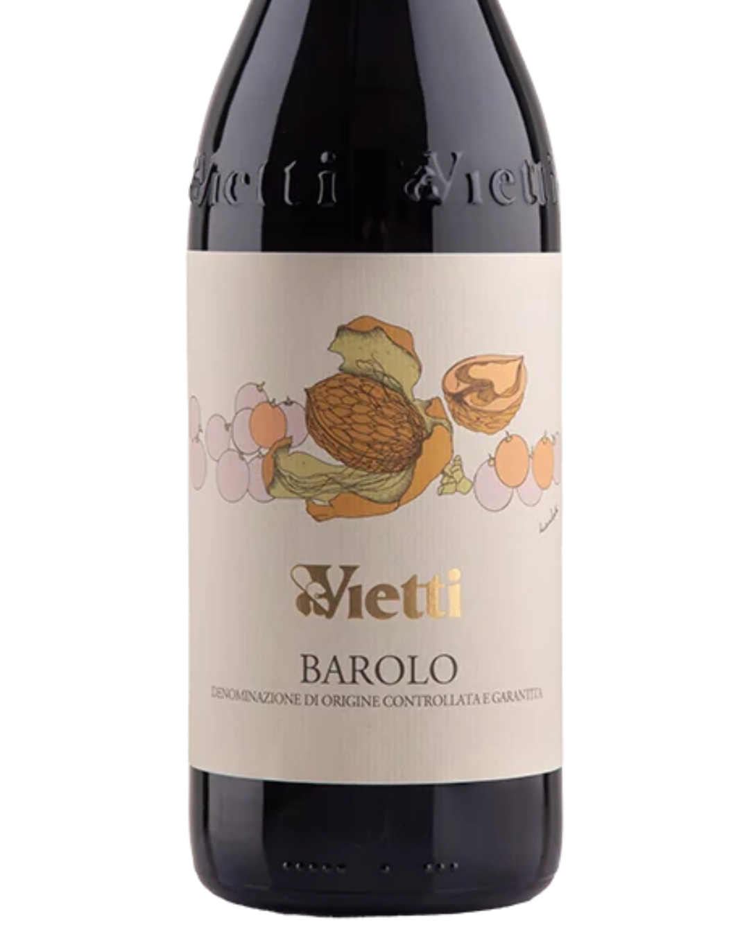
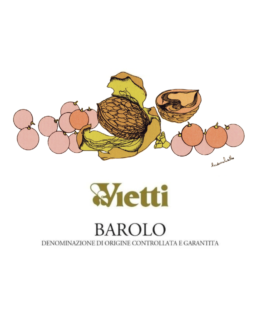
He was also famously hard to pay. He rarely took money and traded labels for wine and olive oil. He stayed close to the anarchist movement all his life, and on weekends he played amateur football, billiards and tarocchi. I was told he gave Vietti so many designs that the estate is still choosing from them.
Rocche di Castiglione
The second stop is Rocche di Castiglione. Alessandro Masnaghetti, the cartographer whose Barolo MGA encyclopedia is treated as the bible of these hills, calls it “in absolute terms one of the most prestigious of the entire Barolo appellation.” It’s also the vineyard where Vietti’s reputation began. It faces east and southeast at 300 to 350 metres. Its topsoil is loose, shallow and sandy, over sandstone laid down some ten million years ago. In 1961 Alfredo bottled it on its own, as one of the first single-vineyard Barolos.
Here the glasses held Rocche di Castiglione and, for comparison, Lazzarito, and the comparison was standing in front of me. From the Rocche rows you look east across the valley to the long ridge of Serralunga d’Alba, its castle tower on the skyline. On the far slope, near the village, is Lazzarito.
Two crus, one narrow valley apart, and two utterly different wines.
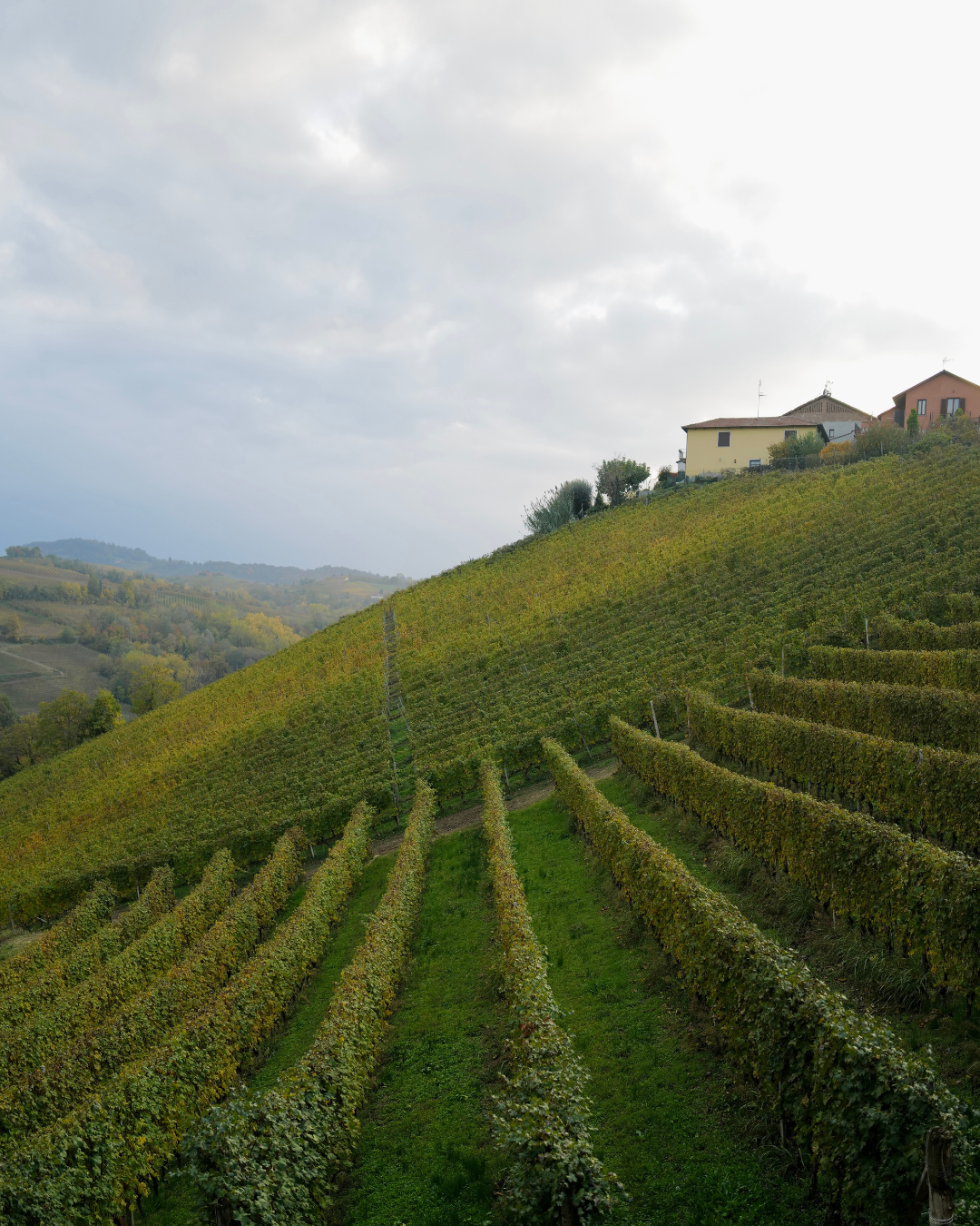

The geology explains the bottles. Castiglione Falletto sits between Barolo’s two sides. Its younger, sandier soils give perfume and fine tannins, while Serralunga’s older, more compact marl gives grip and weight. In the glass, Rocche was silky and fresh, with a hint of rose and citrus peel. Lazzarito was bigger and firmer, its tannins gripping long after the sip. I’m partial to the smoother, more elegant style, and I preferred Rocche.
The art started with Rocche di Castiglione too. In the early 1970s Alfredo Currado and his wife Luciana Vietti, who ran the estate together, opened a bottle of Rocche 1961 with friends, Gallo and Bonichi among them, and decided a wine like that deserved more than a paper label. The etichette d’autore followed in 1974. One artist made one artwork for one vintage. Every label was numbered and glued on by hand, and the artist signed the first hundred.

Villero
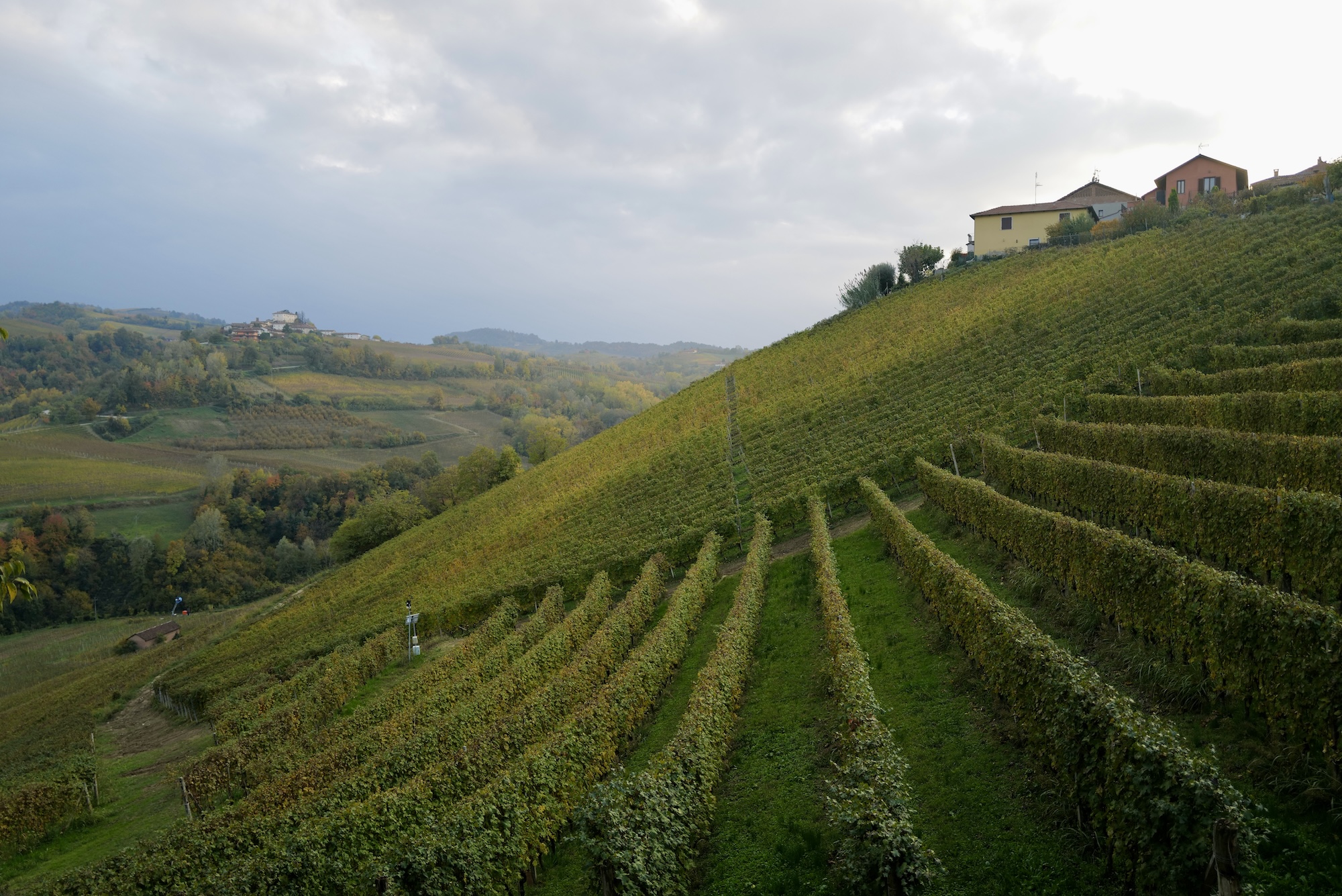
The last stop climbs into Villero, where the soils hold more limestone and the wine has more frame. The pour was Vietti’s Barolo, which is a blend with about 60 per cent from Villero, the same vineyard that makes Vietti’s Riserva Villero, its most prestigious wine.
Since 1989 the artist label has been reserved for the Riserva, and only in great vintages. Gallo drew the first one for the 1982. After that, the house handed the label to a different guest each time, including Wayne Thiebaud, Renzo Piano and, for the current 2026 release, Sterling Ruby. So one hillside holds two ideas of identity: a single constant hand across the whole range, and a guest artist for the rare bottle.
Back to the shop
The trail climbs back into the village and returns us to where we started. The shop reads differently now. The beechwood and the good light no longer seem neutral. They’re the quiet frame that lets the house speak louder.
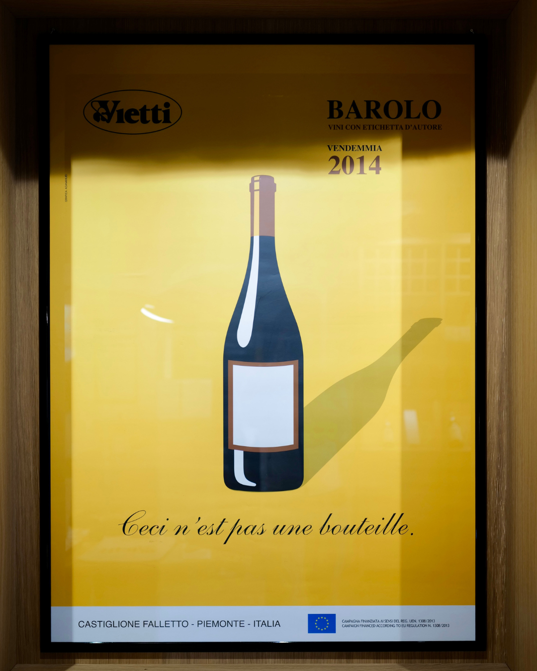

A framed poster in mustard yellow shows a flat, graphic Barolo bottle with a blank label and a long shadow, captioned “Ceci n’est pas une bouteille.” It’s Magritte’s famous joke turned on wine, with the empty label waiting for the guest artist. The cricket and the poster speak in the same voice. They’re just dressed for different rooms.
Tone and Manner, a Normal . method
Normal . separates two things when it shapes how a brand presents itself. Tone of voice is how a brand expresses its personality in words: warm or cool, spirited or restrained, polished or raw. Manner is how that character reaches people in tangible ways — through visuals, design and service as well as words. Manner is where messaging connects to experience.
Vietti is an unusually clear case. Its tone holds steady from bottle to poster: curious, light-handed, a little playful. Its manner changes with the setting: Gallo’s woodcut cricket on the Barbera, a guest artist on the Villero Riserva, Magritte on a mustard-yellow poster, and a beechwood shop quiet enough to let all that colour speak.
Talk to Normal .
We help brands uncover what makes them different — and express it with clarity, craft, and conviction.
Our clients choose Normal because we combine strategic depth with creative artistry. You work directly with the founder and senior experts — every time. No layers. No dilution.
Whether you’re defining a new brand, repositioning an existing one, or shaping a place that tells a story, we help translate purpose into experience — turning insight into impact.

